Client
University of Florida College of Medicine
Years
2018-2020
University of Florida College of Medicine
Years
2018-2020
The Department of Radiology in the College of Medicine at the University of Florida (UF) in Gainesville, Florida, began developing the Wisdom in Diagnostic Imaging program in early 2010. WIDI began as a web-based simulation experience in which radiology residents are assessed over the course of an 8 hour simulated shift.
In 2018 I had the opportunity to work with the staff at the university to analyse the results of 8 years worth of simulation and statistical data to reveal deficiencies common across all participating programs. After significant research and analysis we developed a multi-faceted and fully-integrated online assessment, education, and remediation program for diagnostic radiology residents.
In 2018 I had the opportunity to work with the staff at the university to analyse the results of 8 years worth of simulation and statistical data to reveal deficiencies common across all participating programs. After significant research and analysis we developed a multi-faceted and fully-integrated online assessment, education, and remediation program for diagnostic radiology residents.
My Roles
Strategy
Brand Strategy
Positioning
Content
Voice & Tone
Brand Strategy
Positioning
Content
Voice & Tone
Brand
Identity
Marks & Symbols
Brand System
Art Direction
Illustration
Iconography
Typography
Identity
Marks & Symbols
Brand System
Art Direction
Illustration
Iconography
Typography
Interactive
UI/UX Design
Visual Design
Art Direction
Motion Design
UI/UX Design
Visual Design
Art Direction
Motion Design
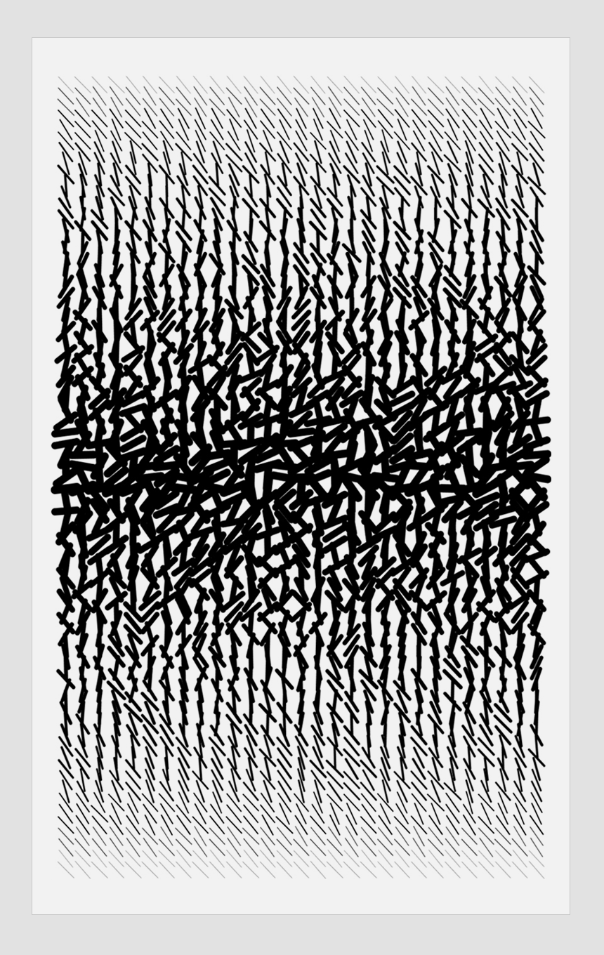
A competitive landscape analysis of other LMS (Learning Management System) platforms in the sector found little investment in product experience or brand strategy, so I decided to focus on custom illustration and iconography, bold layout and motion design to capture the market’s attention.

After creating several moodboards exploring alternative branding approaches for the expanded WIDI platform, the team decided to take a conservative tack and evolve the existing logo rather than completely overhaul the identity.
BRAND DNA
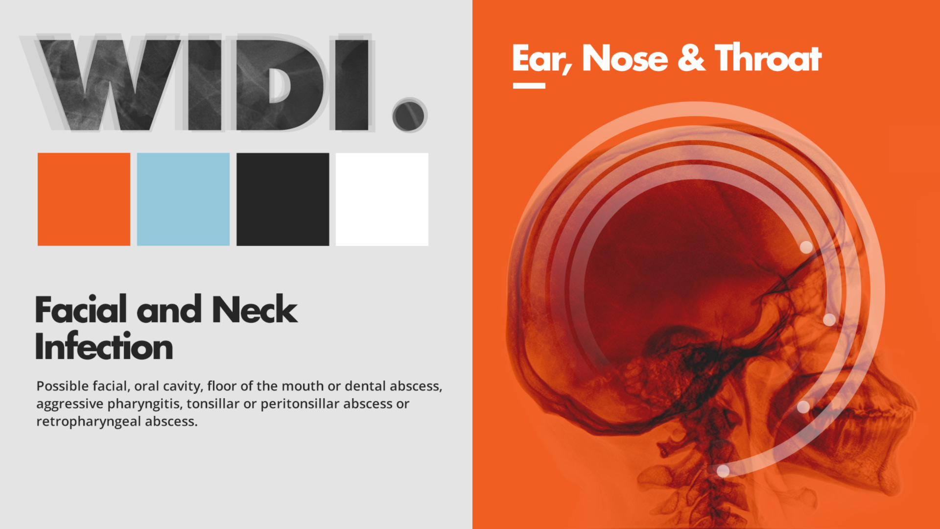
The WIDI brand acknowledges its institutional provenance through bookish typefaces, roman numeral chaptering and highlighter headline accents but incorporates a vibrant modernism unknown to its peers. The staid white and blue hues of the medical profession are represented but are complemented by a wayfinding rainbow of product line colors.
A reassuring and motivational tone is pervasive throughout onboarding and instructional copy. Marketing material and out-of-home advertising conveys the earnestness of the product’s mission and its ambitions to revolutionize medical learning.
Motion is dialed in to engage and excite users during key interactions. Subtle, minimalist line art illustration and warm photography bolster the brand persona with inviting workspaces and images of authentic, engaged people at work.


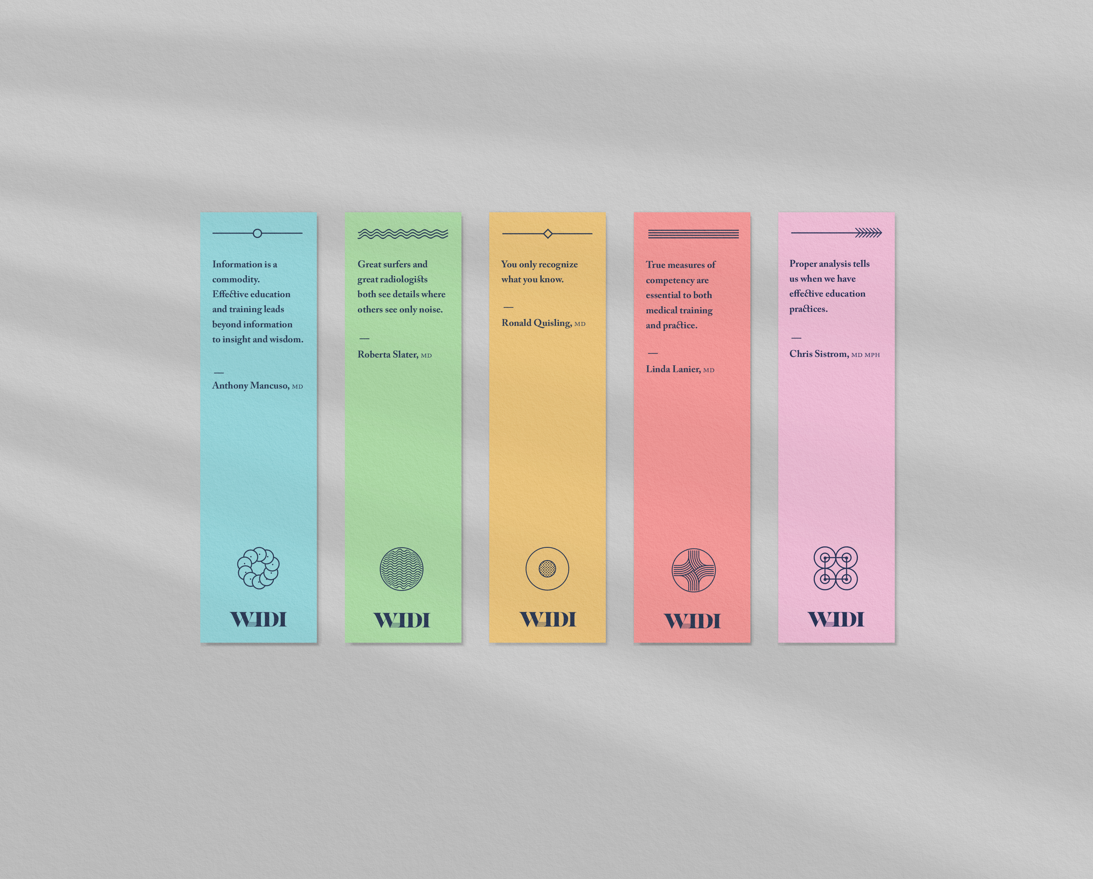
A SECONDARY BRAND
Following the success of the WIDI project, the University of Florida commissioned the development of a mobile app to provide an at-hand lookup and mini-textbook for important measurements and numbers commonly used in radiology practice. I used a softer variant of the brand typeface and a more colorful palette to distinguish from the core platform. I built the user experience around the concept of a branching tree diagram and incorporated ux patterns optimized for speed and responsiveness.
Following the success of the WIDI project, the University of Florida commissioned the development of a mobile app to provide an at-hand lookup and mini-textbook for important measurements and numbers commonly used in radiology practice. I used a softer variant of the brand typeface and a more colorful palette to distinguish from the core platform. I built the user experience around the concept of a branching tree diagram and incorporated ux patterns optimized for speed and responsiveness.


Client
Adobe
Years
2018-2019
Adobe
Years
2018-2019
I worked for Adobe embedded in the open source team tasked with the unification of the organization’s developer ecosystem and later the visual redesign of its developer portal.
The short term goal was to showcase what was possible in a practical way with the Photoshop API. The long term vision conceived of a decentralized approach to building a new home for developers both active and prospective: a critical nexus for all of Adobe’s product teams.
I designed visual directions for various concepts including a website, interactive guides and a developer playground, and created brand positioning strategy while working alongside Adobe’s Spectrum design systems and brand teams.
My Roles
Strategy
Creative Strategy
Stakeholder Interviews
Competitive Analysis
User Research
Positioning
Creative Strategy
Stakeholder Interviews
Competitive Analysis
User Research
Positioning
Brand
Identity
Brand System
Art Direction
Illustration
Identity
Brand System
Art Direction
Illustration
Interactive
Prototyping
Visual Design
UX Design
Motion Design
Processing
Prototyping
Visual Design
UX Design
Motion Design
Processing


RESEARCH ACROSS ADOBE
Before working on the information architecture and visual language of the new portal, I collaborated with staff to produce comprehensive reports designed to synthesize and summarize internal research across all Adobe product teams. Insights from stakeholder interviews, extensive competitive analysis and a thorough audit of both existing material and tooling helped to inform the design process.
Before working on the information architecture and visual language of the new portal, I collaborated with staff to produce comprehensive reports designed to synthesize and summarize internal research across all Adobe product teams. Insights from stakeholder interviews, extensive competitive analysis and a thorough audit of both existing material and tooling helped to inform the design process.


MONOCHROMATIC CHAMELEON
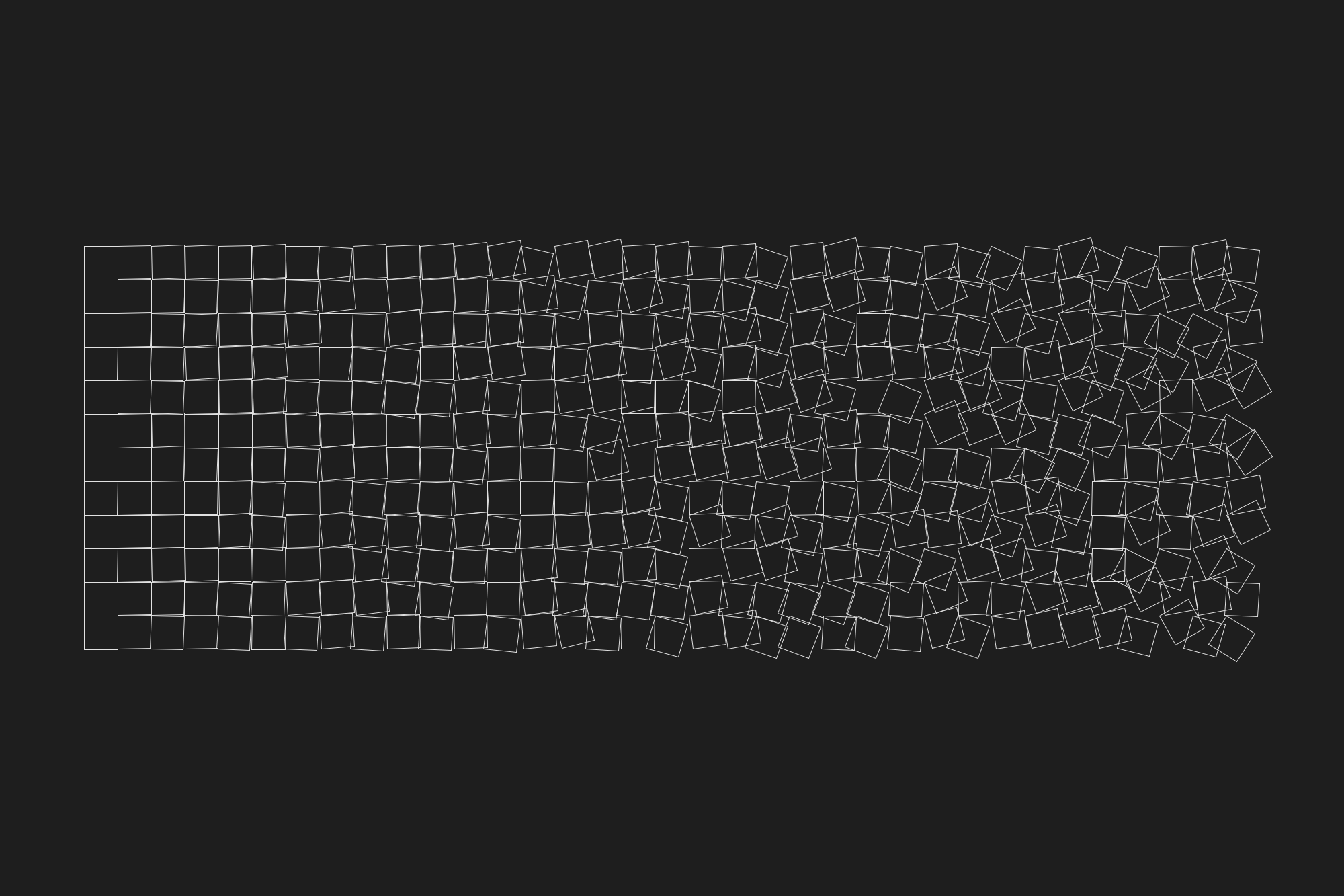
I created the Adobe Developer design system with enough flexibility to promote the work of developer evangelists as well as simplify the work of API documentation authors. This approach was guided by the principle of leveraging generative layout and art to streamline the authoring workflow.
Alongside reimagining the publishing platform, the project also explored integrating a learning management system to help reduce onboarding friction and contribute to developer success through client-side interactivity and features such as progress tracking and context-aware code samples.


GENERATIVE OUTPUT
I produced creative assets from the design system’s limited shape library in compositions inspired by data visualization techniques, graphic art movements and modern artists. I also created proof-of-concept visual experiments using processing language to explore the idea of generating canvas elements on the fly using the same primitive shapes.
I also worked with the Adobe Experience Manager team on a new approach to content layout. We devised a predictive system based on the intuitive Markdown format, that generated layout choices best suited to the structure of the content drafted by the documentation author. This model removed the impediment of templating in the publishing pipeline.


Client
Studio50
Year
2019
Studio50
Year
2019
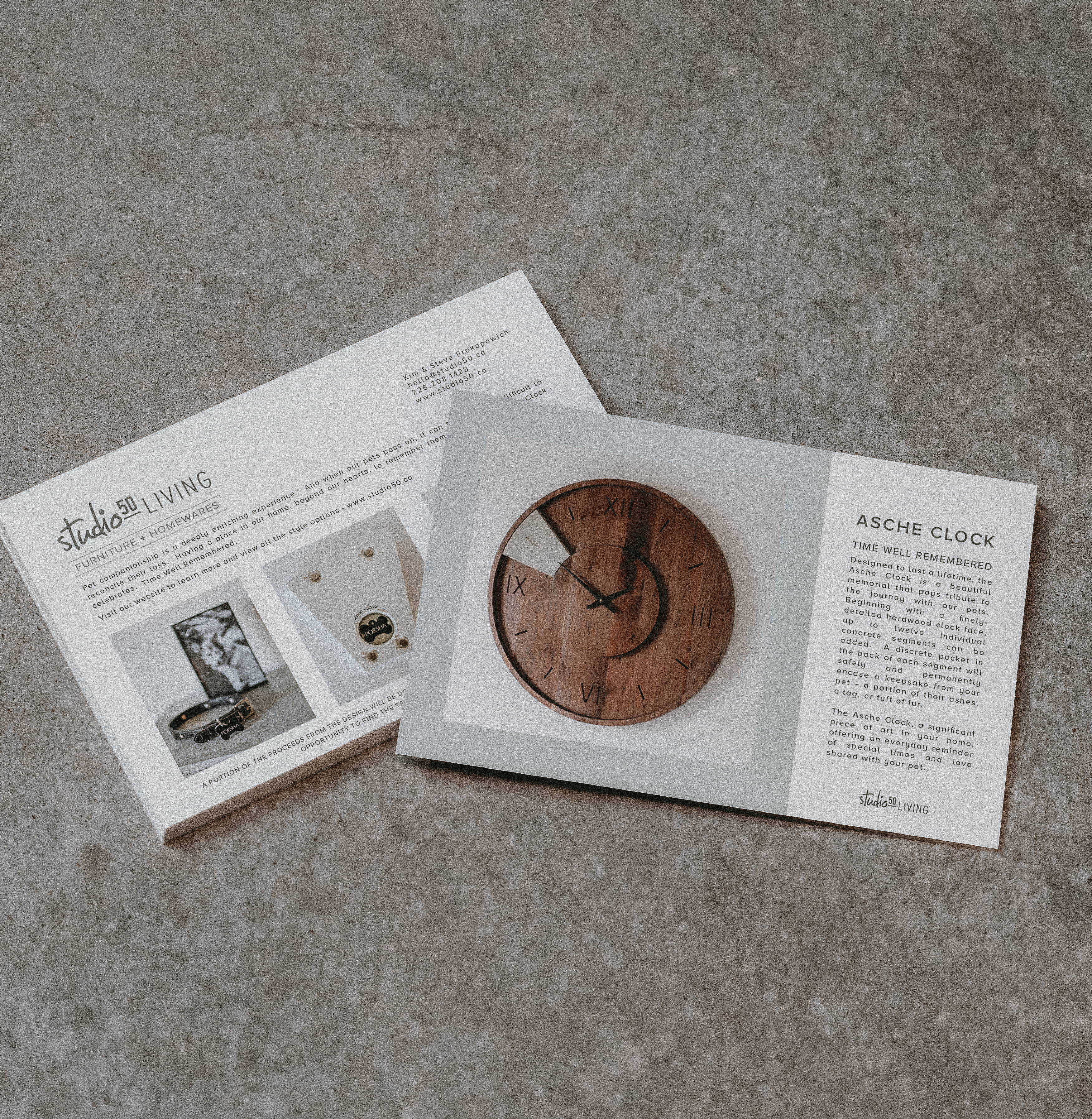
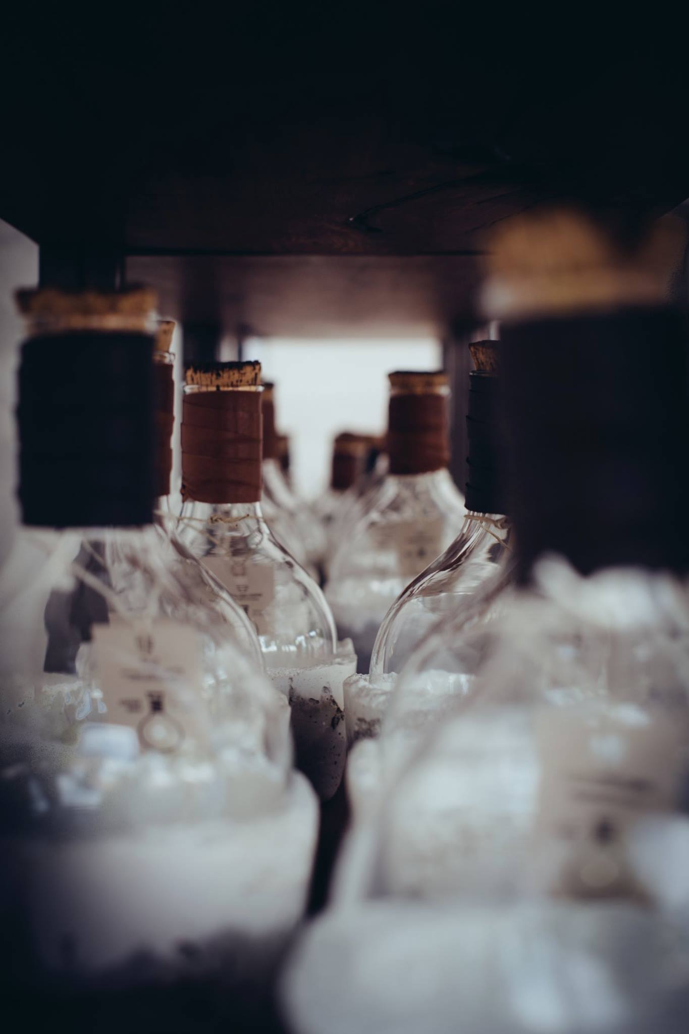
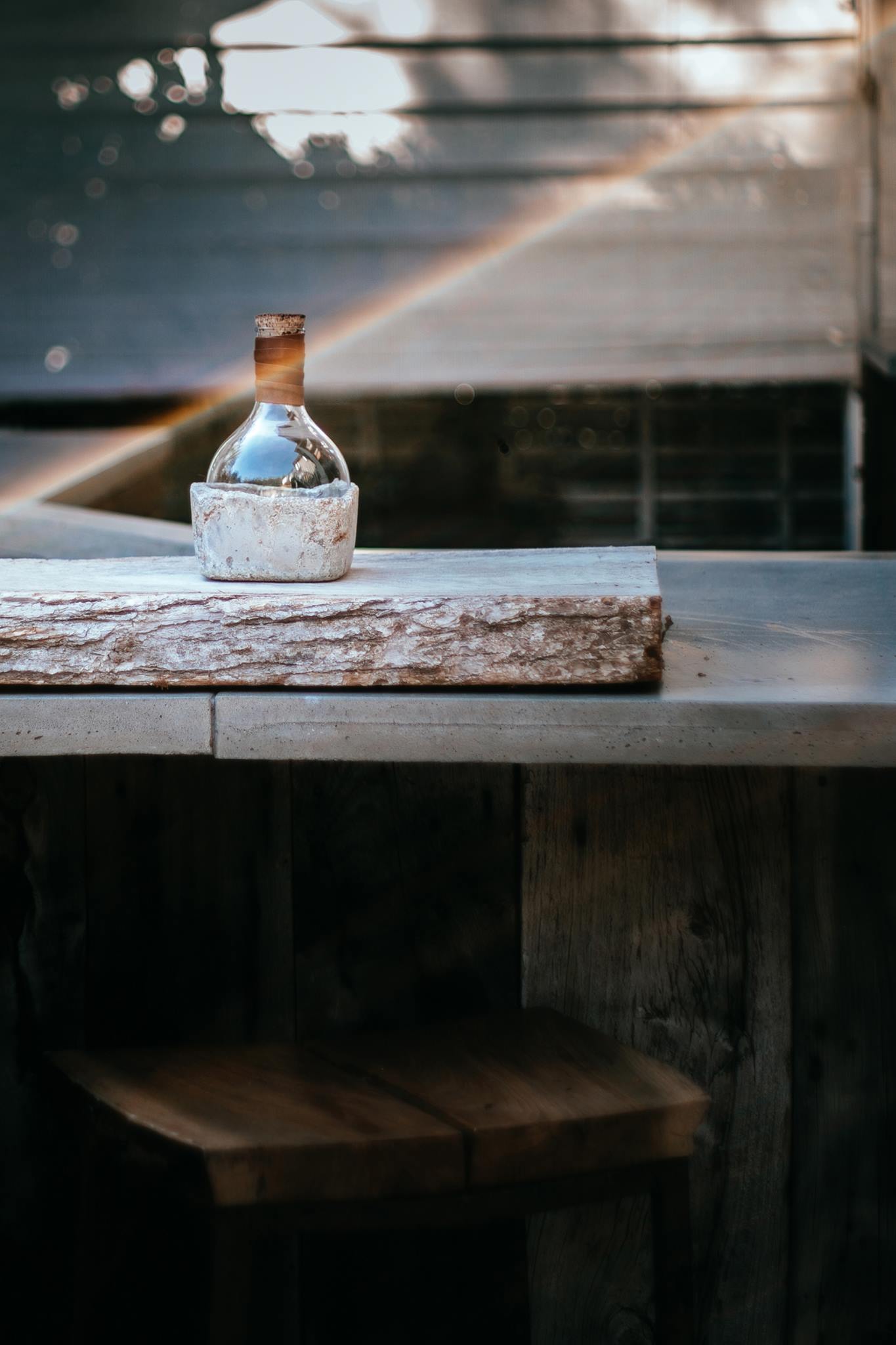
Canadian designer duo, Studio50 hired me to shoot product videography and press release photography to help launch their Asche Clock line. The wall hanging clock houses concrete cast segments designed to memorialize and honor the life and time spent with beloved pets. I collaborated with my design partner and Studio50 to strategize on the appropriate approach and emotional tone with which to introduce the product. We wrote a script outline and helped scout talent and locations ahead of the shoot and edit.

My Roles
Pre-Production
Script writing
Casting
Location Scouting
Shoot Logistics
Script writing
Casting
Location Scouting
Shoot Logistics
Production
Videography
Portrait Photography
Product Photography
Videography
Portrait Photography
Product Photography
Post-Production
Color correction
Editing
Title Design
Color correction
Editing
Title Design


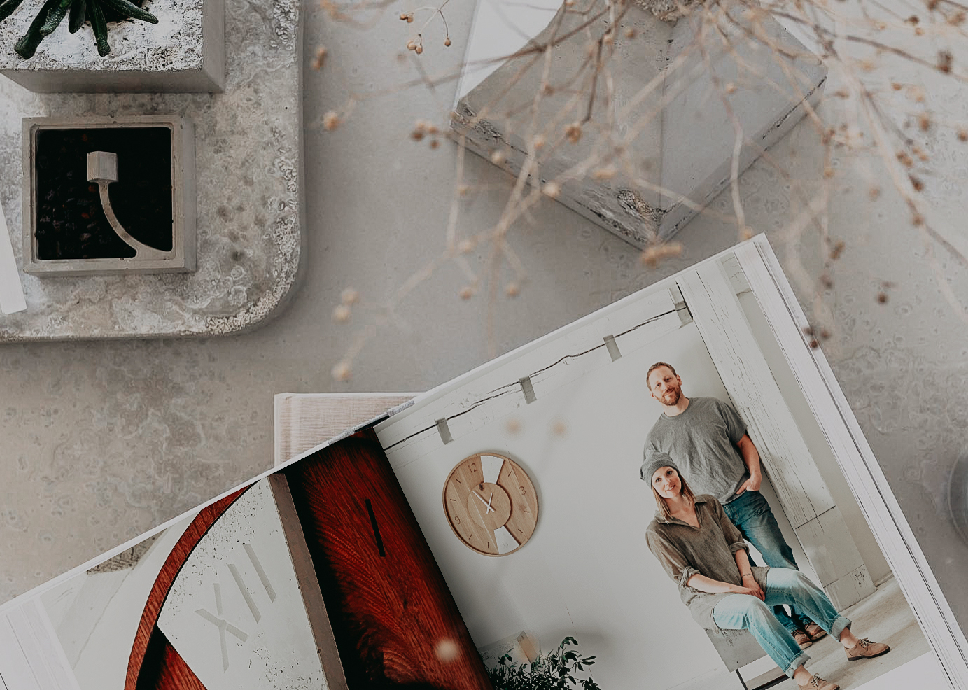

The video was launched across all social channels as well as on Studio50’s website and ran on screen in their trade show booths. I also shot portraits of
the makers,
husband and wife team Steve and Kim Prokopowich
to include in the product press release kit.


Showed my parents over the weekend and they needed Kleenex. Thank you so much, we are beyond thrilled.
——— Kim Prokopowich, Co-founder
After watching through it many times this morning, it’s absolutely wonderful. We really appreciate all of the time you have put into the video for our passion project, Mark. Will need to put a note up for the audience on its rating ... tissue box required!
——— Steve Prokopowich, Co-founder


CREATIVE PARTNERSHIP
Beyond the Asche Clock project, I shot both lifestyle and product photography for studio50’s other hand-cast concrete furniture and homeware lines for their marketing material. I focused on delivering images that captured their unique aesthetic sensitivities and their natural understanding of how design can integrate with people’s lives
Beyond the Asche Clock project, I shot both lifestyle and product photography for studio50’s other hand-cast concrete furniture and homeware lines for their marketing material. I focused on delivering images that captured their unique aesthetic sensitivities and their natural understanding of how design can integrate with people’s lives


Client
United Nations Special Rapporteur on the Right to Housing
Years
2018-2020
United Nations Special Rapporteur on the Right to Housing
Years
2018-2020
The UN-appointed Special Rapporteur on the right to housing is a watchdog for human rights violations around the world. Leilani Farha served as Special Rapporteur from 2014 until 2020. I worked with
Leilani to rebrand both her presence online and her out-of-home
outreach initiatives. I redesigned and built a new website to convey her global mandate and house her extensive report archives.
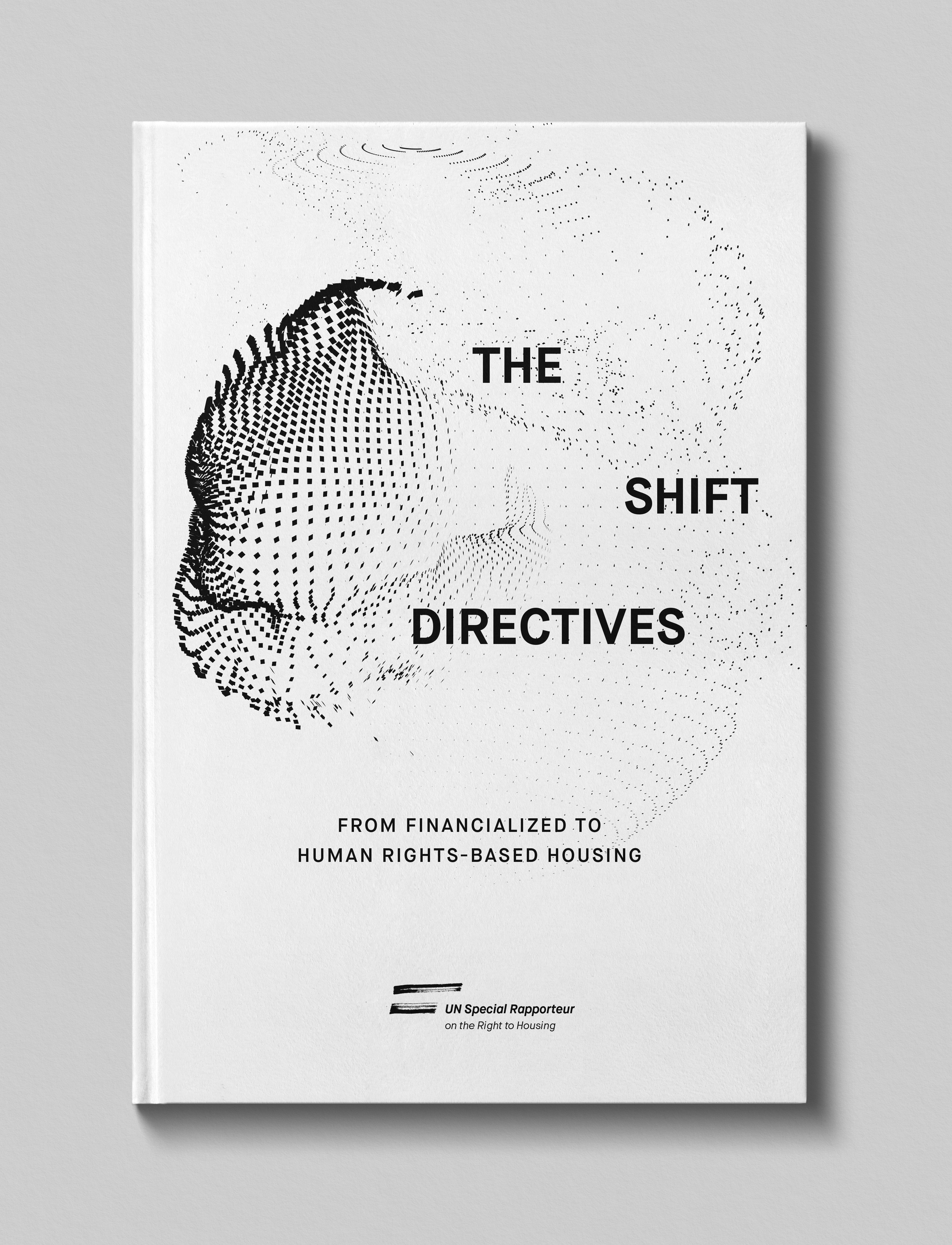
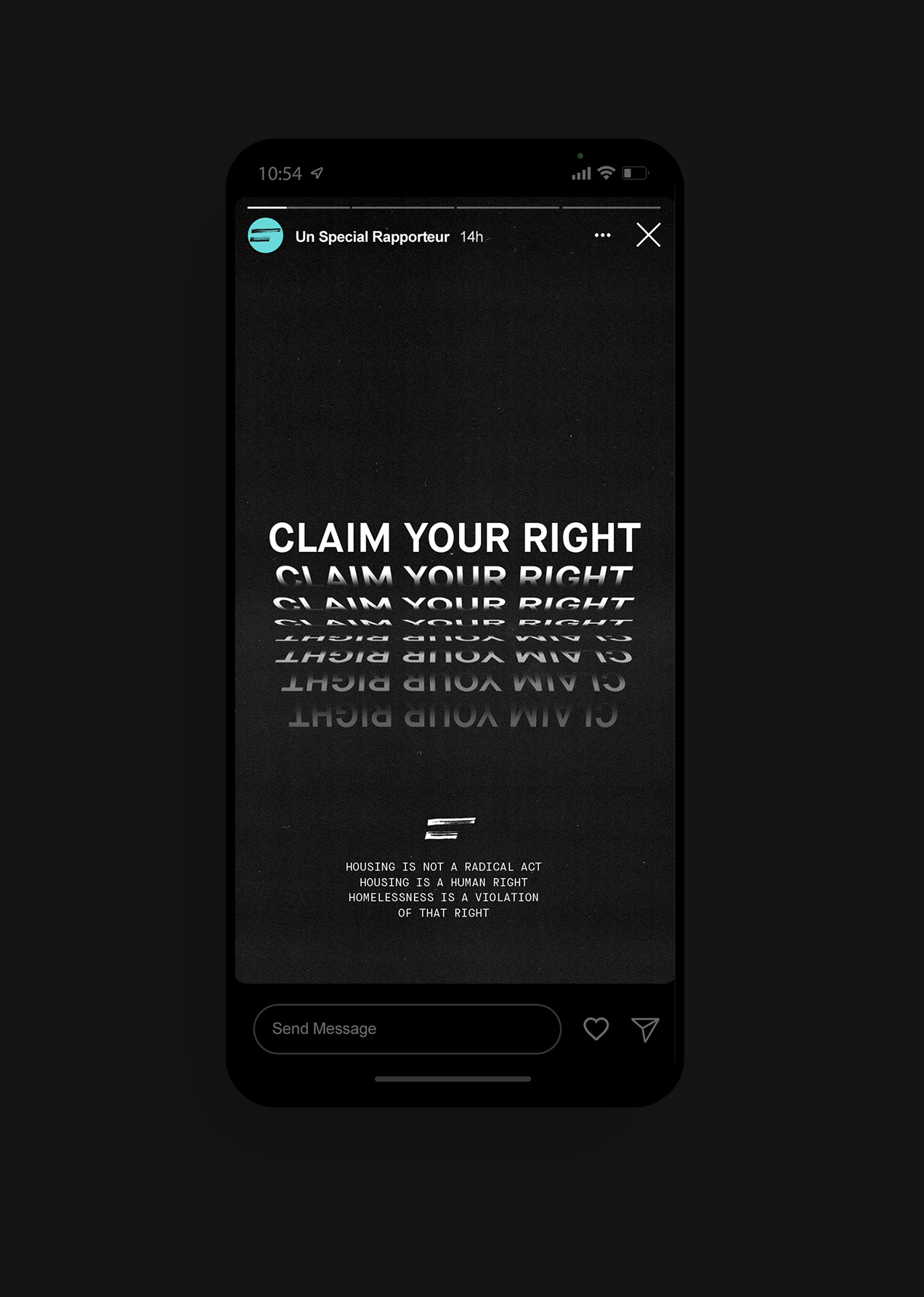
Leilani launched The Shift in 2017 with the UN Office of the High Commissioner for Human Rights and needed a secondary brand to live beyond her six-year term as special rapporteur. The Shift is a movement and manifesto to push back on the worldwide housing crisis manufactured by global real estate investment and government inaction.
Leilani launched The Shift in 2017 with the UN Office of the High Commissioner for Human Rights and needed a secondary brand to live beyond her six-year term as special rapporteur. The Shift is a movement and manifesto to push back on the worldwide housing crisis manufactured by global real estate investment and government inaction.
My Roles
Strategy
Brand Strategy
Positioning
Content
Brand Strategy
Positioning
Content
Brand
Identity
Marks & Symbols
Copywriting
Brand System
Art Direction
Typography
Outdoor Media
Identity
Marks & Symbols
Copywriting
Brand System
Art Direction
Typography
Outdoor Media
Interactive
UI/UX Design
Visual Design
Art Direction
Motion Design
Front-end Development
CMS Implementation
UI/UX Design
Visual Design
Art Direction
Motion Design
Front-end Development
CMS Implementation
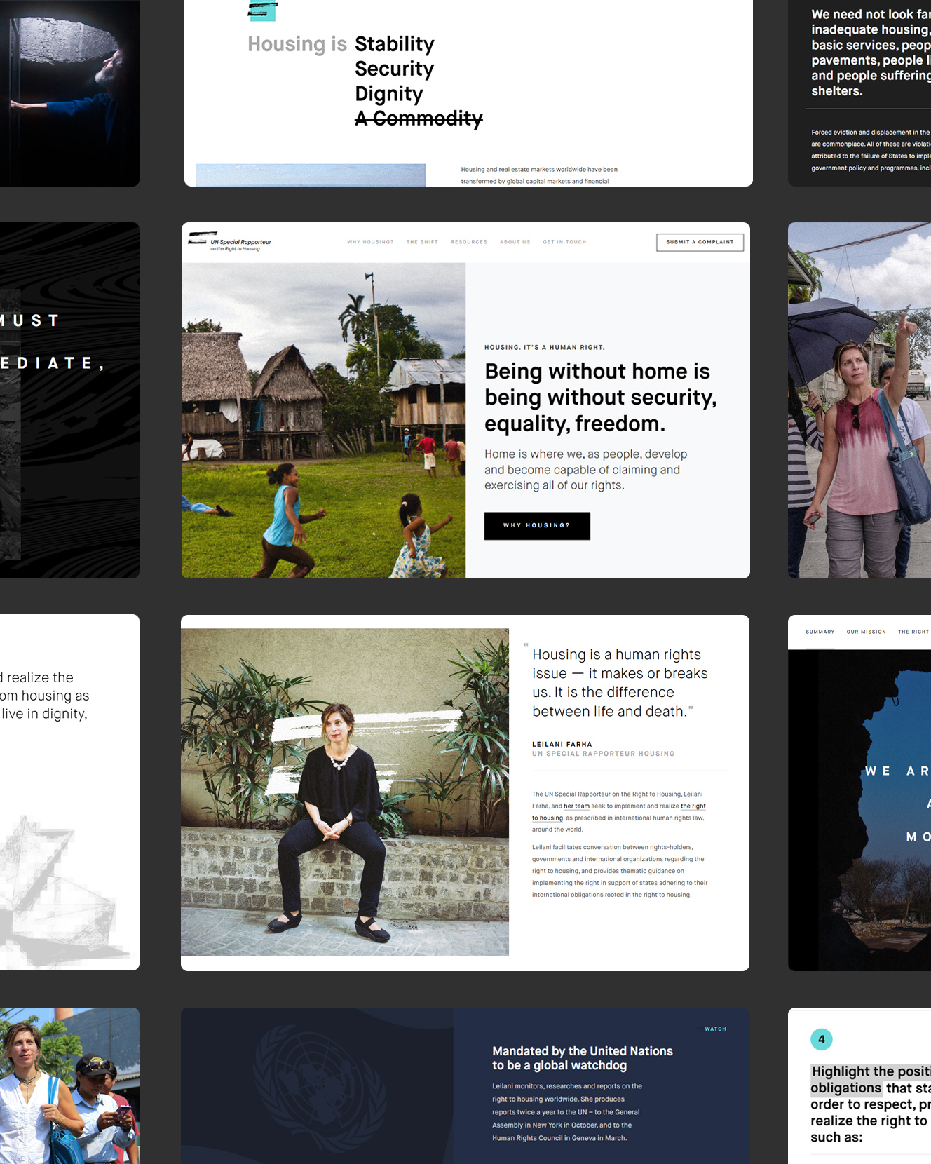
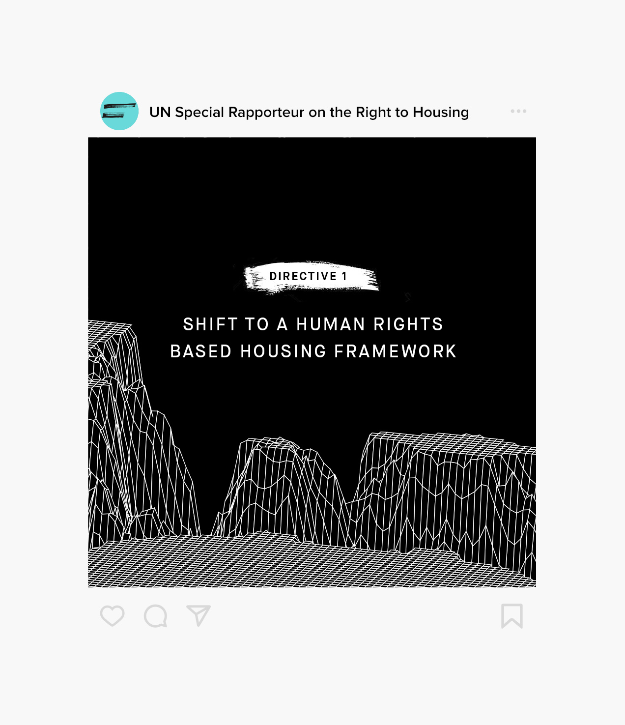
A BLACK AND WHITE ISSUE
The pared-down and minimalist Special Rapporteur brand conveys the starkness of the current lack of access to proper housing. I chose to combine arresting photography from in-the-field documentary journalists with an unequal-sign logomark and bold typography driven layout to raise the tenor of conversation and level of concern for the unfulfilled right to live in safety and dignity in a decent home.
The pared-down and minimalist Special Rapporteur brand conveys the starkness of the current lack of access to proper housing. I chose to combine arresting photography from in-the-field documentary journalists with an unequal-sign logomark and bold typography driven layout to raise the tenor of conversation and level of concern for the unfulfilled right to live in safety and dignity in a decent home.


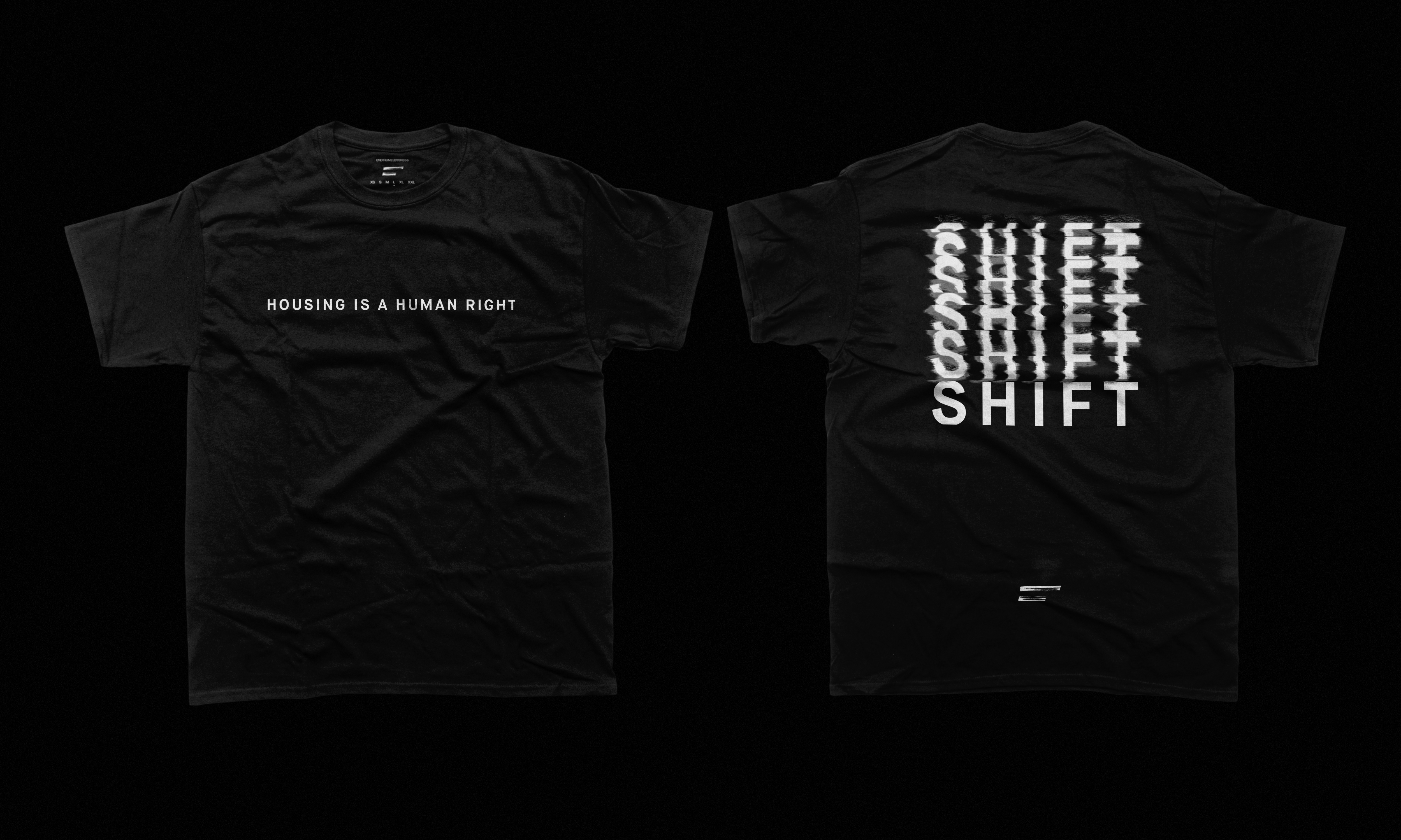
MAKE THE SHIFT
The Shift relies on the same foundational brand constructs but is refracted through the lens of mass social movement. I employed more experimental graphic design techniques to express the urge for political action and the need for a paradigm shift in people’s mindsets.
The Shift relies on the same foundational brand constructs but is refracted through the lens of mass social movement. I employed more experimental graphic design techniques to express the urge for political action and the need for a paradigm shift in people’s mindsets.